One reason gmail 2.0 on iOS still sucks
You probably downloaded the new Gmail client for iOS with high hopes today. So did I. But as a recipient of email, and professional who works in the email space, one thing totally ruins the app.
I want to show you:
The big problem with Gmail for iOS 2.0
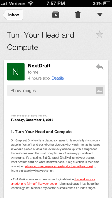
This is Nextdraft, an awesome daily newsletter from Dave Pell. It’s loaded in Gmail for iOS.
What’s wrong with this picture?
One thing is the ridiculous decision to create a thick grey moat around email content shrinking an already small viewport. That seems like a visual designer got their way instead of the simpler UX – letting the content fill the width.
But that’s not the main problem.
This newsletter (and other mail like this) is uncomfortably small to read. So, what can you do? Pinch to zoom?
Here’s what pinch to zoom looks like:
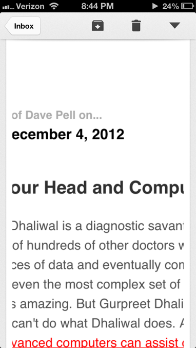
Well, our awesome grey borders stay, but the text gets chopped off once you hit an easy to read level.
How does Mail.app handle the same email?
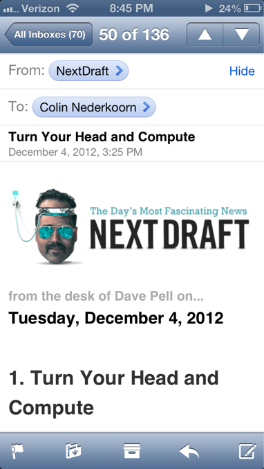
Pretty well. @media queries are respected, and the email is easy to read.
Let’s scroll and see what the text looks like:
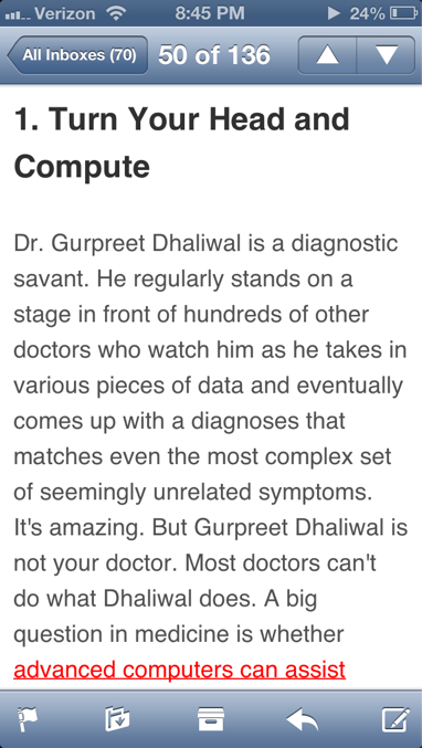
As you can see from the screenshots Mail.app handles basic email rendering in a mobile setting WAY better than Gmail.
So, google folks. I know you worked hard on this update. Your search is SO good compared to Mail.app. But I have to ask…
Why release an update to Gmail for iOS and tout “numerous new animations from swivels to transitions” when the way you display an email is still a terrible and awkward experience for the user?


